5 Tips for Optimizing Your Website for Mobile Users and Simplifying User Experience
Nowadays, the vast majority of people own smartphones. The global mobile user base stands at 7.1 billion and is expected to reach 7.26 billion this year. Optimizing your website for mobile markets has never been more relevant than right now.
We live in a fast-paced, technology-driven world, so having a website is absolutely necessary for any business to be viable. It is important to optimize the website for mobile experiences. People want to access their information quickly and while they are on the go.
What Does Mobile-Friendly Mean to a User?
A mobile-friendly website is one that responds or changes based on the user’s device. This could imply that the website transitions from a three-column layout to a single-column display. Unnecessary elements are hidden or shrunk to allow more important information to reach the viewer.
The following are advantages of optimizing your website for mobile users:
- Faster loading times
- Less data consumption
- Better user experience
- Easier navigation
What Does Mobile-Friendly Mean to a Business?
Visitors to your website are there for a reason: they came for your content and user experience. But if your potential customers meet poor layout, inconvenient navigation, and images that refuse to load, they are likely to abandon your site and go to one of your competitors.
You will gain the following advantages by optimizing your website for mobile users:
- Better search engine ranking
- Increased sales
- Higher conversion rate
- More loyal customers
5 Tips for Optimizing your website for mobile markets
1. Make it responsive
You may have visited a website while using a mobile device and had to scroll to the side to see the entire page because they did not design it to fit the screen. This is not only inconvenient but also detrimental to the website’s search engine performance.
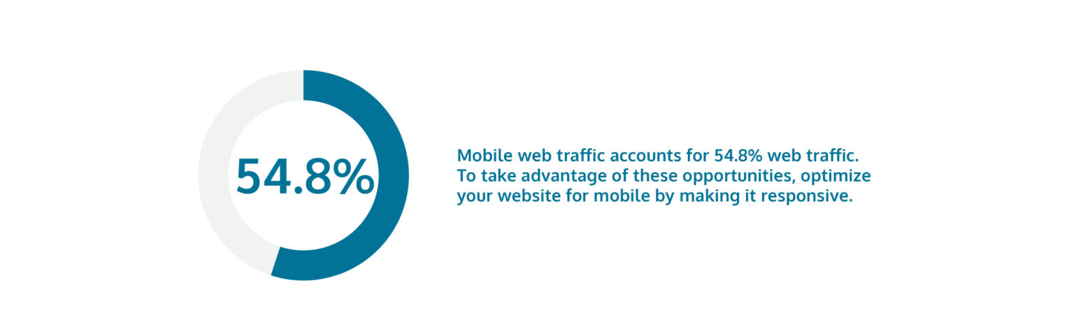
Mobile web traffic accounts for 54.8% web traffic. To take advantage of these opportunities, optimize your website for mobile by making it responsive.
Responsive design means that the website adjusts its size and layout to fit the screen your visitors view it on.
For example, most websites have a navigation menu in the page’s header, with various elements arranged horizontally. When you access the same page on a mobile device with a responsive design applied to it, you will notice the same menu arranged in a drop-down format, allowing you to see all the elements on the smaller screen.
2. Use Less Content
You may make the mistake of keeping similar content on the mobile and desktop versions of your website. While this is not always a bad idea, keep in mind that the amount of content on the desktop version can be overwhelming on a smaller screen. It may also cause the website to load more slowly.
Consider why someone is visiting your page on a mobile device rather than a desktop computer. They may be out and about and need to get the information they need quicker.
Here are some tips to reduce the amount of content a visitor has to see:
- Swap longer copy with a shorter one
- Remove photos or reduce their size
- Hide unnecessary elements out view in drop-down menus
3. Design For Speed
53% of consumers will abandon a mobile site that takes over 3 seconds to load. Mobile users are typically on the go all the time, and they have little patience for slow-loading mobile sites.
If you want to keep mobile users’ attention long enough to generate leads or drive conversions, here are some pointers:
- Keep redirects down: Redirects slow down your site because it takes the server time to locate and retrieve the content that the website requires displaying.
- Compress images: Large images on your website will take a long time to load. Compress or reduce your images to speed up the process.
- Simplify your web design: An appealing website will need a large amount of code and resources, making your site heavier and thus slower. To make the website lighter and faster to load, keep the design simple but elegant.
- Minify your code: Your website has a lot of code, and some of it is unnecessary. Minify your website’s code by removing them, and your site will be lighter and faster.
4. Improve Mobile Experience For Return Buyers
It is cumbersome to enter credentials and data into mobile devices without a proper keyboard. If you value returning visitors, optimize your website for mobile with a mechanism in place to prevent them from having to redo the work from scratch.
Many online visitors switch between different devices. Creating a seamless experience for your returning visitors will continue what they were doing in their earlier session. This includes making sure that any data or information they’ve entered on another device isn’t lost during the handoff.
5. Organize Your Navigation Elements
To display the right navigational items on the right devices, it is critical to find what people access the most on their mobile phones. With so little space, sorting your menu items alphabetically will not offer a pleasant experience for them.
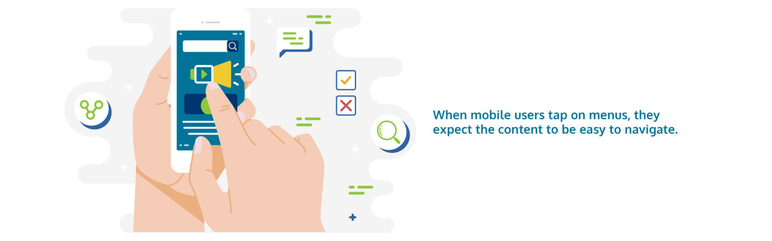
When mobile users tap on menus, they expect the content to be easy to navigate. Using Google Analytics or other clickstream tools, identify the sections that your users are visiting the most and display them on your hamburger menu.
You could also include a visual navigation in the main content area so that mobile visitors can see your primary products or service categories right away.
Conclusion
Businesses that do not plan for hand-held devices will fall behind in an age dominated by them. A mobile-optimized website will help you in keeping your customers satisfied while they navigate through your website, regardless of the device they use.
Optimizing for mobile is not always easy. In many cases, it can be quite difficult. Consider enlisting the help of professionals – like the Vonazon team. Contact us for more information and a free consultation.
Account Executive
Vonazon Inc.

Vonazon can guide you through the process of creating fun and effective short form videos that are unique to your brand. We can also help you create campaigns around your videos that deliver results, grow your brand’s social media presence, and produce more leads.
Contact us today to begin your short form video journey.


