Top 7 Website Trends for 2020
Before, we hop into the top website trends for 2020, let’s take a look back! This new year marks the thirtieth anniversary since computer scientist Tim Berners-Lee changed life as we knew it forever with the invention of the World Wide Web (WWW). Technology has molded the landscape of societies and cultures around the world more so in these last thirty years than ever before with worldwide connectivity at your fingertips.
With the rise in modern technology comes the rise of consumers expectations of convenience. Businesses have felt the pressure to compete on an entirely new level, which has been a huge motivator for the rapid innovations of the last three decades. As 2019 comes to an end, we encourage you to look into a new decade. We thought it would be helpful to give you a head start on website trends to keep you ahead of the curve. So, without furthering our nerdy internet history lesson, here are the top 7 website trends for 2020!
Glitch Art:
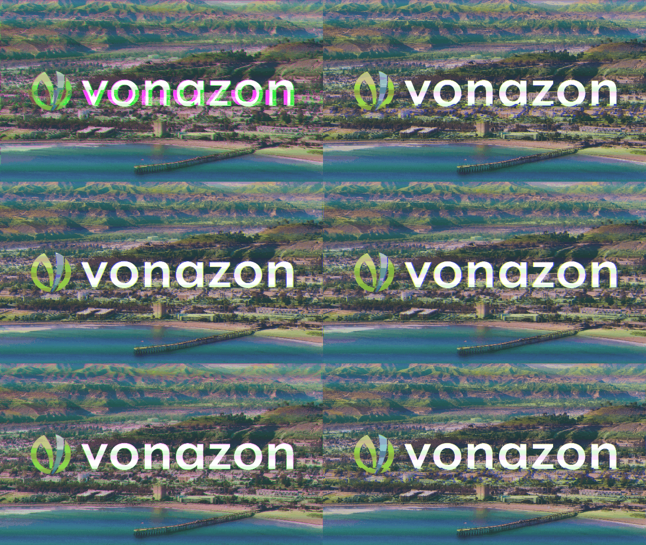
The most hipster of all the trends on this list, glitch art. Visually impactful and sometimes confusing to the eye, it turns a coder’s nightmare into an art form. Reminiscent of an image loading on the WWW in 1993, oh the nostalgia. Check out our glitch art below and then try making your own with this cool generator!
AI:
Yes, the term Artificial Intelligence seems intimidating and honestly a little too futuristic at times, but ladies and gentlemen 2020 is here and so is AI. This amazing innovation allows you to provide a more authentic and personalized experience for your users. Combining AI & Chatbot technology creates a powerful tool to establish easy connection and increase the overall satisfaction of your website visitors. AI can bring robust analytics and behavior about your audience to further enhance your online presence and increase sales in the long run.
Asymmetry:
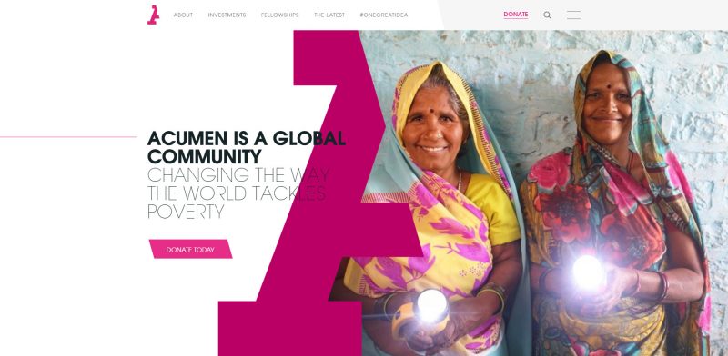
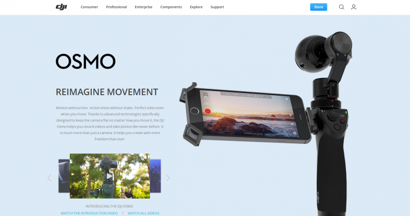
This year will be the battle between asymmetry and minimalism. While the human brain is naturally attracted to symmetrical visuals, we also seem to be pulled to graphics that confuse our eye a bit, this trend does just that. Creating a not-so-obvious imbalance in your hero images and graphics on your website can cause visitors to pause for a second while their brains make sense of what they are looking at. Here are some great examples:

Minimalism:
On the other end of the spectrum lays minimalism. The attention span of the average adult today is an impressive 8 seconds, which is shockingly lower than that of a goldfish at 9 seconds. Minimalism gives you the opportunity to convey only the most important visuals and text. To get your message across before the 8 seconds comes to a close, we recommend having a team member look at it for ten seconds and then ask them what stood out. Keep it short and clean to keep up with this website trend for 2020!
Single Page Applications (SPAs):
Possibly the future of websites, SPAs aim to avoid interruption to the user as much as possible. This requires all HTML, JavaScript, and CSS to be retrieved in the initial page load or to be dynamically added based on the actions of the visitors. These pages do not reload or transfer to another page and they encompass everything within themselves for the best user experience (UX) possible. Some prime examples of SPAs would be social platforms:
Progressive Web Applications (PWAs):
This website trend for 2020 could potentially have a huge impact for years to come. Progressive web applications (PWAs) are on their way to becoming the next evolution of the native application. Once opened or installed, PWA’s function in low connectivity environments, they do not require users to update them manually, and take up significantly less memory on devices. They mimic the user experience of a native applications on mobile devices while offering a significantly improved user experience. All that tech talk can seem a bit confusing, so here are a few examples (take a look at them on your mobile device):
Motion UI:
Following with the same trend of glitch art, Motion UI introduces movement into an otherwise static online experience. By adding GIFs, videos, transitions, or subtle animations you greatly increase the likelihood that a visitor will stay on your website longer. We have introduced this method into our very own website, so take a look around and try to find all our Motion UI “Easter eggs”.
Are you on track to stay on the cutting edge with website trends for 2020?
Vonazon is here to support you in staying on the cutting edge with the top website trends, don’t look back and see a missed opportunity because hindsight is 20/20! Work with us!


