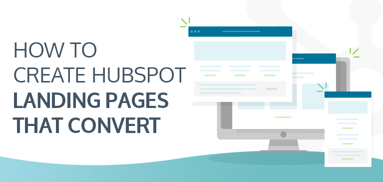
How to Create HubSpot Landing Pages that Convert
A landing page could be considered the halfway point between an email and a website. It is more content-rich than the former but without the many distractions of the latter. A landing page aims to convert visitors into leads, in most cases, by offering something of value. In this article, we discuss some essential landing page guidelines.
Though all landing pages share these fundamentals, they are not created equal. There are plenty of examples of free landing page templates and designs on the web. However, what works for another company’s product or service may not necessarily work for yours. Here are seven landing page guidelines and best practices to keep in mind when building emails and landing pages using a marketing automation platform, such as HubSpot.
Align Email and Landing Page
Your email and landing page should be cut from the same cloth. The visual style should be consistent, and the copy should be clear in terms of what you have to offer. Most importantly, you do not want to deviate from the expectations set by your email. No one likes being fooled, so stay true to your email copy and value offer.
Avoid Distractions
Landing pages are meant to convert prospects into leads, not showcase your website, your new events page, or any irrelevant products and service offerings you may have – save that for the Thank You page! Most landing pages do not feature the regular website navigation menu for precisely this reason. Remaining consistent with the design of your webpage will help avoid confusion and strengthen your brand identity.
Include Social Proof
There are many ways to include social proof on your landing page. The intention is to establish trust between you and your prospects by showing that your product or service is vetted, reliable, and beneficial. Different types of social proof include reviews, blurbs, logos of publications that you have been featured in, or clients that you have worked with.
Optimize for Multiple Devices
It is always best practice to ensure that all your webpages are equally optimized for mobile, tablets, and desktop browsers. Your landing page should be no different. Test your landing page for different screen sizes, and make sure that it is responsive to all typical devices. You want to make it as easy and convenient as possible for your prospects to convert.
Form Length and Placement
Your form should be a quick way to capture what you need in order to nurture your new lead, not test their patience. We recommend keeping forms as short as possible, utilizing multiple-choice options whenever possible, and implementing multiple steps. Remember to include a privacy policy and comply with all applicable regulations in your target market.
Include a Thank You Page
A good Thank You page should be optimized to continue the prospect’s journey post-conversion. Now is the time to feature engaging content from your website, how to connect with your company on social media, and products or services to check out next.
Consider Using a Template
A landing page template can be a great way to either get started or switch up your existing efforts to seek out more quality conversions. Vonazon is currently offering to design and build a custom-branded email and landing page template in your HubSpot for free. Get in touch, and our team will develop an eye-catching email and landing page combo tailored to your business.
Account Executive
Vonazon Inc.

Vonazon can guide you through the process of creating fun and effective short form videos that are unique to your brand. We can also help you create campaigns around your videos that deliver results, grow your brand’s social media presence, and produce more leads.
Contact us today to begin your short form video journey.


